Drawing a Shield with One Div
Have you ever seen A Single Div by Lynn Fisher? The following example is in no way as impressive but follows the same concept: drawing an item using CSS and only one HTML div.
I was inspired by seeing this site explaining the concept of using multiple values in the border-radius value. I already knew you could do this, but looking at the shape reminded me of a shield, and things escalated from there.
Final result and CodePen:
See the Pen Shield by Claire (@claireparker) on CodePen.
In the rest of this post, I’ll explain the CSS I used to create this image.
Note: I’m using CSS variables to set colours throughout my examples.
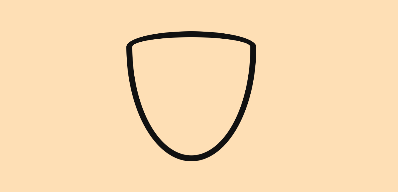
Draw the shield shape
First create a single div with a class name of ‘shield’ and set a height and width. Apply a border. Then the fun begins: use border-radius to create the shape. Read this article by the creators of the tool I linked above to learn more about how the slash values create this shape.
:root {
  --shield-border-color: #111;
}

.shield {
  height: 200px;
  width: 200px;
  border: 10px solid var(--shield-border-color);
  border-radius: 50% 50% 50% 50% / 12% 12% 88% 88%;
}
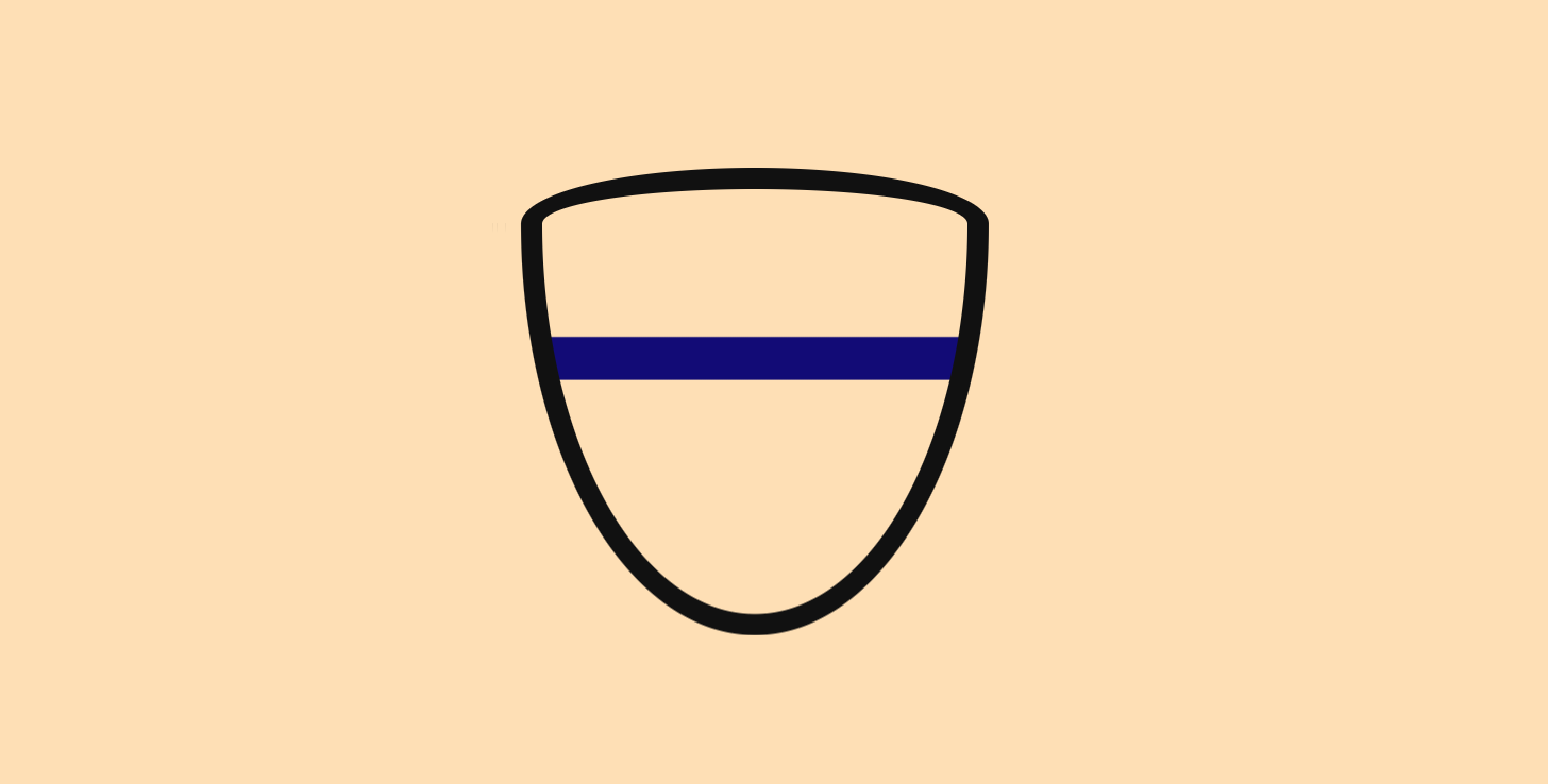
Create the horizontal line of the cross
Use a linear-gradient to create a horizontal line across the middle of the cross shape. At each intersection of the transparent colour and blue cross colour, use an identical percentage for the color-stop value. This creates a hard line between the colours instead of the fading gradient. I’ve defined the width of the line as 10% of the overall shield. By starting at 35%, I’ve positioned the cross at a what I think is a pleasing distance partway down the shield instead of exactly halfway.
:root {
  --cross-color: #110078;
  --shield-border-color: #111;
}

.shield {
  height: 200px;
  width: 200px;
  border: 10px solid var(--shield-border-color);
  border-radius: 50% 50% 50% 50% / 12% 12% 88% 88%;
  background-image: linear-gradient(
      transparent 35%,
      var(--cross-color) 35%,
      var(--cross-color) 45%,
      transparent 45%
    );
}
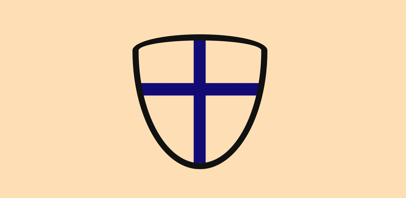
Create the vertical line of the cross
We can apply multiple gradients to the background-image property by comma-separating them. For this second gradient, do something similar but add 90deg as the first argument. This rotates the gradient. Change the percentages of the color-stops so that the line is exactly halfway along the shield area.
:root {
  --cross-color: #110078;
  --shield-border-color: #111;
}

.shield {
  height: 200px;
  width: 200px;
  border: 10px solid var(--shield-border-color);
  border-radius: 50% 50% 50% 50% / 12% 12% 88% 88%;
  background-image: linear-gradient(
      transparent 35%,
      var(--cross-color) 35%,
      var(--cross-color) 45%,
      transparent 45%
    ),
    linear-gradient(
      90deg,
      transparent 45%,
      var(--cross-color) 45%,
      var(--cross-color) 55%,
      transparent 55%
    );
}
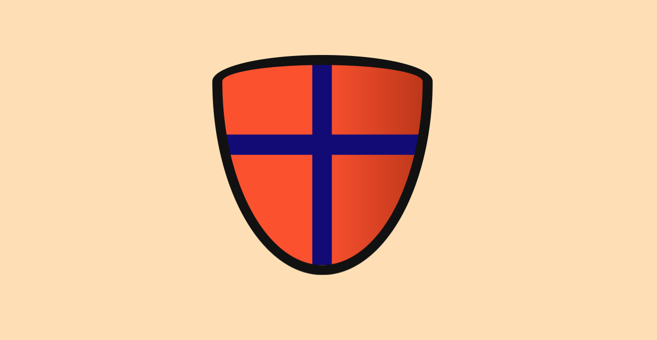
Add the background
Finally, add a third gradient for the background. This could also be achieved by adding a plain background-color, but I wanted to use a gradient to give the shield a little depth.
:root {
  --cross-color: #110078;
  --shield-border-color: #111;
  --background-color: #ff5022;
  --darker-background-color: #bf360c;
}

.shield {
  height: 200px;
  width: 200px;
  border: 10px solid var(--shield-border-color);
  border-radius: 50% 50% 50% 50% / 12% 12% 88% 88%;
  background-image: linear-gradient(
      transparent 35%,
      var(--cross-color) 35%,
      var(--cross-color) 45%,
      transparent 45%
    ),
    linear-gradient(
      90deg,
      transparent 45%,
      var(--cross-color) 45%,
      var(--cross-color) 55%,
      transparent 55%
    ),
    linear-gradient(
      90deg,
      var(--background-color) 50%,
      var(--darker-background-color) 100%
    );
}
Use your new shield to protect you from bugs in your code!