Making a sticky sidebar with two lines of CSS
Have you ever been on a website where an element “sticks” to the screen and follows you as you scroll down the page? This is what I call a sticky sidebar, and I’ve spent many hours battling with legacy code trying to debug one. In the past, developers used JavaScript to build this feature, by recalculating the position of the sidebar on the browser’s scroll event. This was complicated to maintain and also costly for performance.
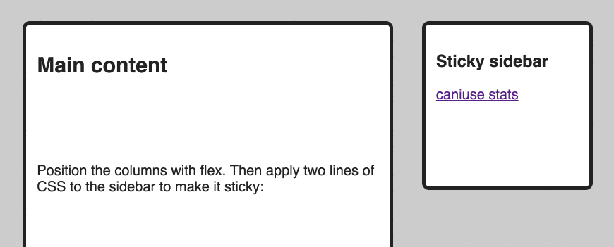
Recently I was delighted to discover that all major desktop browsers (Chrome, Firefox, Edge and Safari) now support the CSS property position: sticky. (Aside from a bug in Chrome with some table elements.) You can check this on caniuse.com. Edge was the final browser to ship support in October 2017 in version 16. This means that we can build a sticky sidebar using just two lines of CSS, with no JavaScript required! Let me show you how.
First set up two divs. One represents the main page content and should extend past the bottom of the screen. The second will be the sidebar. We use flex to position them side-by-side, because it’s 2018 and also because I love flex.
Use the following HTML and CSS:
<div class="wrapper">
  <div class="main">
    Main content
  </div>
  <div class="sidebar">
    Sticky sidebar
  </div>
</div>
.wrapper {
  display: flex;
  justify-content: space-between;
}

.main,
.sidebar {
  border: 3px solid black;
  padding: 15px;
  background-color: #fff;
}

.main {
  width: 60%;
  height: 150vh;
}

.sidebar {
  width: 25%;
  height: 25vh;
}

body {
  background-color: #ccc;
  font-family: sans-serif;
  padding: 10px;
}
This gives us two elements that look like this:
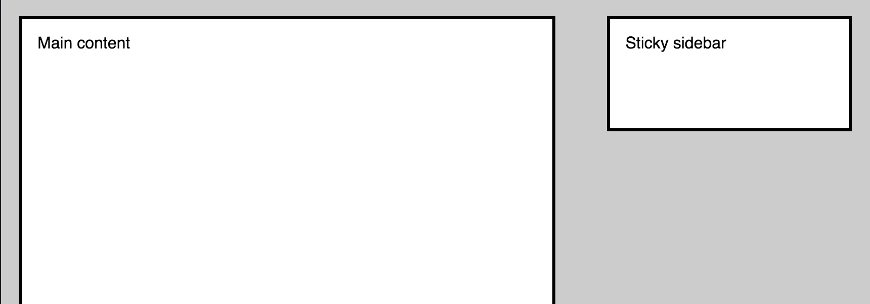
Note the heights of the main and sidebar elements are set using vh units. 100vh is the height of the current viewport, so setting the height of the main div to 150vh gives it a height that will be 1.5 times that of the screen.
But the sidebar isn’t sticky yet! When you scroll down the page, the sidebar doesn’t follow. All we need to do to fix that is to add two lines of CSS:
.sidebar {
  position: -webkit-sticky;
  position: sticky;
  top: 0;
}
(OK I lied, three lines for Safari compatibility with the -webkit- prefix.) And there you have it, scroll down the page and the sidebar will stick to the top of the screen and follow you down!
The position: sticky property tells the element to stick to the screen, (MDN can explain this better than me), and the top value tells the element where to sit relative to the screen as it scrolls. We could change this to top: 5% to leave a gap, or for example left: 0, depending on the direction of the scroll.
Here is one I made earlier on CodePen:
See the Pen Sticky Sidebar by Claire (@claireparker) on CodePen.
Try changing the height of the sidebar to 110vh and see how it stops at the bottom of the screen. Nice!
Can I use position: sticky in production?
position: sticky is still an experimental API, so use with caution. Read the draft spec here. Always consider which browsers you support when making a decision like this. Combine this information with caniuse to make an informed decision. Use the stats for all browsers on caniuse and not just the newest versions. Ask yourself, how would it affect the user’s experience if the sidebar wasn’t sticky? Would the website break completely or would they lose a nice-to-have decorative feature?
As always, it depends on your particular app and there isn’t an answer that applies to every situation. But it’s really cool that we can now build features like this purely with CSS and a handy tool to have in your CSS toolkit.