Improving colour contrast ratios in Atom
Atom is an open source text editor and is as customisable as you’d expect a piece of open source software to be (i.e. very). If you want a new piece of functionality, chances are a package already exists for it. The same goes for design themes. But it’s also simple to make small style tweaks to your UI without overhauling your whole colour scheme. I recently did this to make the tree view easier to use for my poor old eyes 👀.
I had been happy with the default theme in Atom for a while, but I realised I was struggling to read the names of gitignored files and folders in the tree view. The text colour of gitignored filenames is darker compared to normal files, making them easier to visually ignore too. I work on codebases that contain a lot of generated content that isn’t committed to the git repo, so I have a lot of these grey files. But I found the resulting colour contrast difficult to read. This was a problem because I still spend a lot of time interacting with this code in tree view. So I decided to change the colour to something easier on the eyes 👀.
Here’s an image of how my tree view looked on my Mac, using Atom version 1.13.1 and the One Dark UI and Syntax themes.
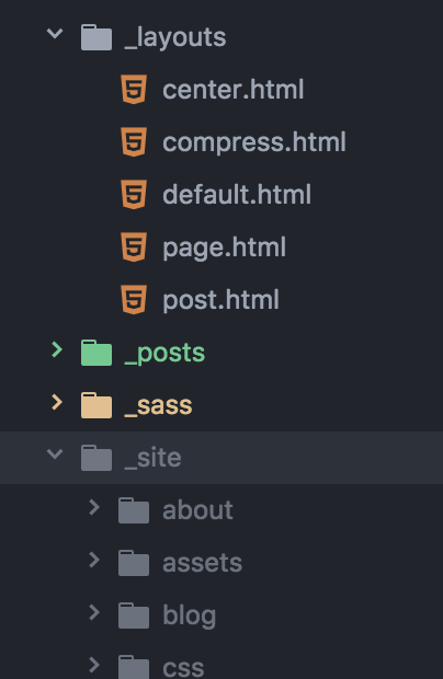
From top to bottom, the image above shows examples of how untouched files, new folders, folders containing edited files and folders included in my .gitignore file appear. Notice how difficult it is to read the gitignored filenames. This is because the colour contrast between the background colour and text colour is low. Let’s improve that.
Find out your current colour contrast ratio
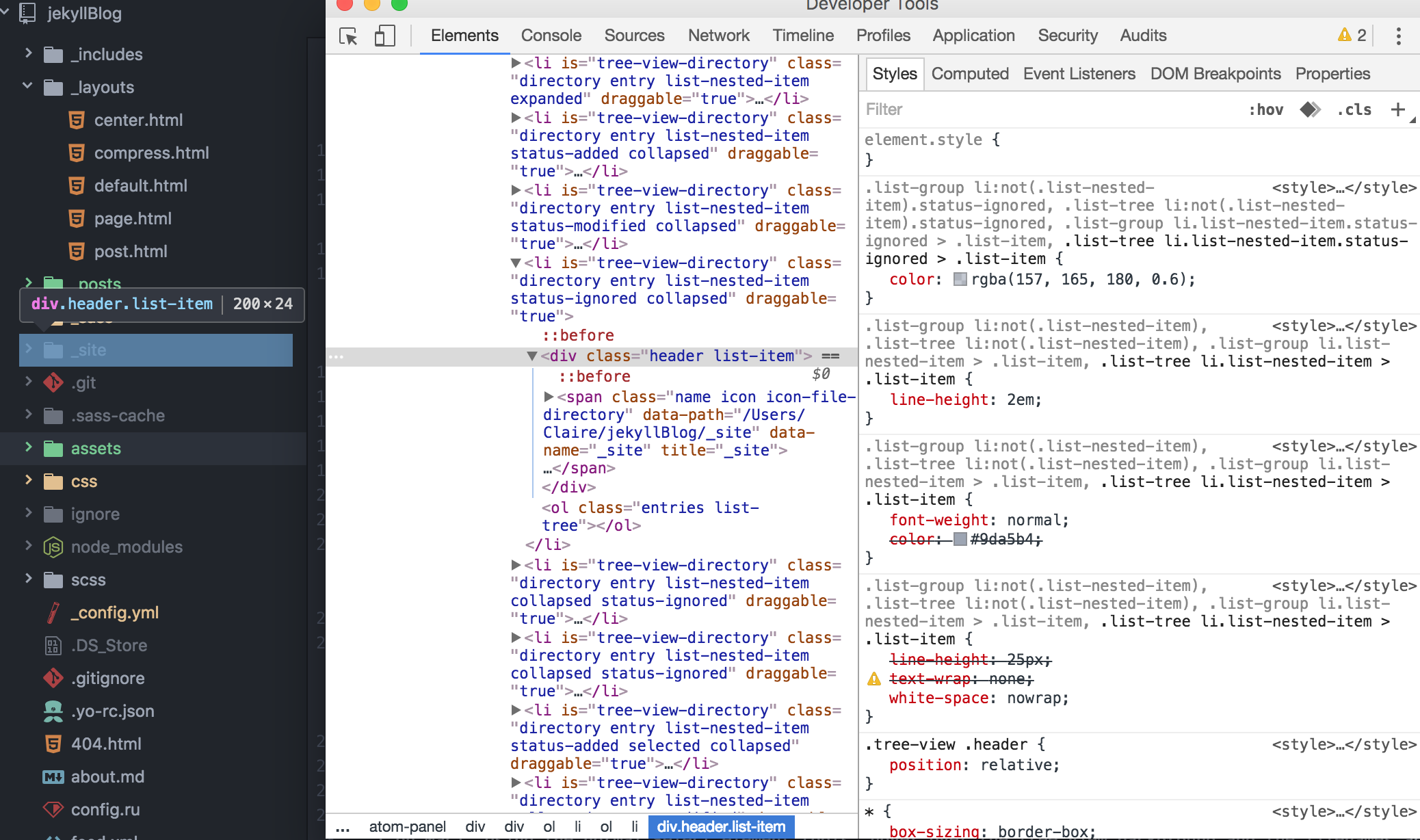
Atom is built using Chromium, which means it comes with Dev Tools built in. Press the same keyboard command as you would in Chrome to open Dev Tools (Cmd + Alt + I on Mac). Using the Select element tool, inspect the tree view background and filenames and note which colours they use for display. You may need to dig around in the Computed Styles tab as the DOM in the Atom editor can be quite verbose.
Once you have both of those values, open a good colour contrast ratio calculator tool on the web. Try either Lea Verou’s contrast ratio or the excellent WebAIM Color Contrast Checker. Calculate the colour contrast ratio for the two colours you found earlier.
Note: You may need to convert the rgba colour to hex format. For example the tree view titles returned a value of rgba(157, 165, 180, 0.6) for me. I like to use HSL color Picker which provides the colour in different formats and a snazzy slider tool that I can use to choose new colours!
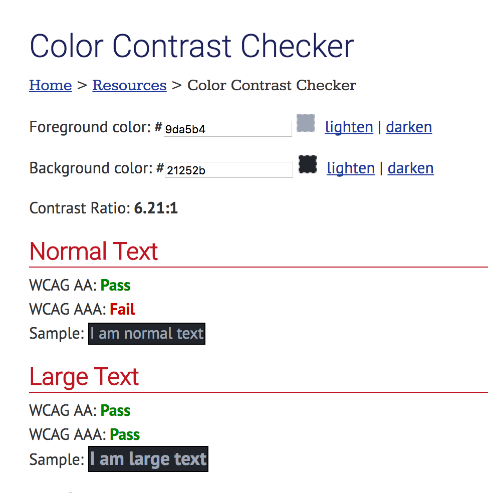
The image above shows the contrast ratio for the gitignored text against the tree view background. The ratio of 6.21:1 is just shy of the 7:1 ratio required for AAA level accessibility. The explains why I found the text difficult to read. I played around with the colours on the WebAIM page and lightened the text to a nice shade of #d1d5dc, which increased the ratio to 10.45:1.
Change your colours in Atom
Atom has a stylesheet that contains user-specific style customisations. This is where we should put our colour changes. The stylesheet is accessible from the main Atom menu in the Menu bar on a Mac: open Atom > Stylesheet… . Using Dev Tools again, work out which selectors you need to apply the new styles to and write a new Less style. You should see your changes as soon as you save and give Atom a second to recompile.
My selectors look something like this:
// Change tree view colours to create WCAG AAA standard contrast
.list-group li.list-nested-item.selected > .list-item,
.list-group li.list-nested-item > .list-item,
.list-group li:not(.list-nested-item).selected,
.list-group li:not(.list-nested-item),
.list-tree li.list-nested-item.selected.status-ignored > .list-item,
.list-tree li.list-nested-item > .list-item,
.list-tree li:not(.list-nested-item).selected,
.list-tree li:not(.list-nested-item) {
    color: #d1d5dc;
}

// This is for gitignored files in the tree view.
// It doesn't quite make AAA standard but it's AA, and is distiguishab;e from the non-gitignored files
.list-group li.list-nested-item.selected.status-ignored > .list-item,
.list-group li.list-nested-item.status-ignored > .list-item,
.list-group li:not(.list-nested-item).selected.status-ignored,
.list-group li:not(.list-nested-item).status-ignored,
.list-tree li.list-nested-item.selected.status-ignored > .list-item,
.list-tree li.list-nested-item.status-ignored > .list-item,
.list-tree li:not(.list-nested-item).selected.status-ignored,
.list-tree li:not(.list-nested-item).status-ignored {
    color: #c09194;
}
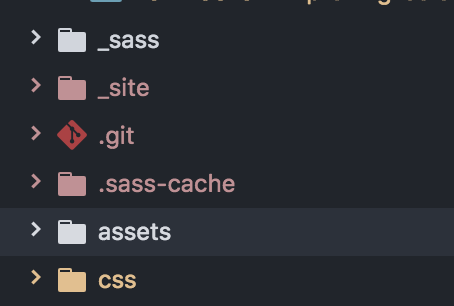
And my resulting colours in the tree view look like this:
Why stop there though? How about making that green for new files pop a little more? Or change the tab name titles? Or even comments in files, which are pretty much unreadable for me in this theme unless I squint!
Why don’t you just change your theme!?
Of course, you could install a different theme with a different colour scheme that is easier to read. But there will always be elements of the UI that you will want to style differently, and now you know how. Plus isn’t it cool interacting with a desktop application through Dev tools??
Bonus
I use the sync-settings package to save all my settings in a Gist so that I can share them between machines. This includes this stylesheet I worked on in this post.